Your Velocity Chart Is Lying To You
Linear assumes one dev-hour ships one point. With Claude Code, it ships four to seven. Here's how we rebuilt velocity tracking to learn each person's real multiplier from history.

Jun 15, 2026
Every project tracker quietly assumes the same thing: one developer, working for one calendar hour, ships one point of work. Story points, velocity charts, burndown — all of it rests on that conversion. It worked for a decade.
Then we put Claude Code and git worktrees in everyone's hands, and the conversion broke.
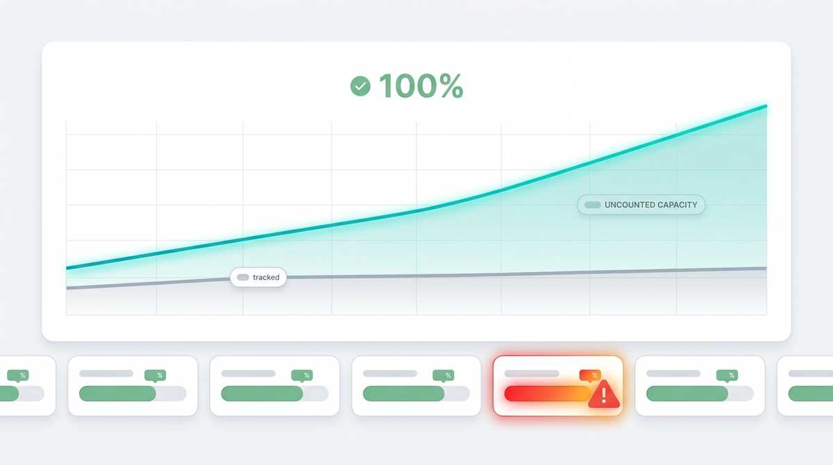
A senior developer running three or four parallel agents now ships four to seven points in the time the chart still scores as "one hour of one person." Velocity didn't go up by 10%. For some people it went up by 600% — and the chart had no way to see it. It kept measuring raw points against calendar time, kept undercounting our real capacity, and kept telling us nobody was overloaded when some people clearly were.
This is how we fixed it: not by inflating estimates, but by learning each person's effective multiplier from their own history and applying it automatically.
The Tempting Wrong Fix
The obvious move is to pre-multiply the estimates. If a developer is "4× faster," size their tickets at a quarter of the hours.
We rejected this hard, for three reasons:
- It destroys the estimate as a shared language. A 5-point ticket should mean the same thing whoever picks it up: roughly five hours of focused work for a standard developer. The moment you bake a person's speed into the number, two people can't talk about the same ticket anymore.
- The multiplier isn't one number. It's different per person, it's different for small tickets versus large ones, and it drifts every time the tooling improves. Anything you hand-encode is wrong within a month.
- It hides the signal you actually want. The interesting question isn't "how fast is this ticket" — it's "is this person speeding up, slowing down, over-loaded, or stuck?" Pre-multiplied estimates erase exactly that.
So we kept the estimate honest — one point equals one hour of focused work, standard-developer pace, never pre-multiplied for parallelism — and moved all the per-person variation into a separate, learned layer.
Learning The Multiplier From History
The core idea is simple: for every ticket a person has ever closed, we already know two things — what we estimated it at, and how long it actually took. The ratio between them is their multiplier on that ticket.
multiplier_for_ticket = (estimate_points / 8) / cycle_days
One person closing an 8-point ticket in a single working day is running at 1×. Closing it in two hours is running at ~4×. Do that across someone's entire history of closed tickets and you have a distribution, not a guess.
We don't just average it, because a naive mean lies in both directions. The aggregation is:
- Recency-weighted with a 30-day half-life, so last quarter's pace doesn't drown out this month's.
- A weighted median, not a mean, so one ticket that sat in review for three weeks doesn't tank the whole number.
- Reported with an interquartile range, so we can show how confident the figure is, not just the point estimate.
- Split by ticket size — small tickets (1–3 points) and large ones (5+) get separate multipliers, because batching small work behaves nothing like grinding through a big feature.
People with too few closed tickets to be meaningful fall back to a conservative default instead of producing a confident number from three data points. The whole thing self-calibrates: nobody edits a config file when someone gets faster. The history does it.
Two Clocks, Two Multipliers
Here's a subtlety that took us a while to get right. There are two different questions hiding inside "how long did it take," and they need two different clocks.
- Active-cycle time — only the stretches where the ticket was actually In Progress, weekends excluded. This measures pure engineering speed. It's the number you want for a team-velocity conversation.
- Calendar-cycle time — wall-clock from start to done, including every hour the ticket sat waiting in a review queue. This is the honest number for cost.
The gap between them is enormous for some workflows. A developer's pure coding speed can be 5×, while their calendar-time-to-close is far slower because their PRs wait on review. If you used the active number for cost, you'd halve their cost on paper — but you still paid for every hour the work sat in the queue. So engineering speed reads from the active clock, and money reads from the calendar clock. Same data, two valuations, no fiction in either.
What You Build On Top
Once each person has a trustworthy multiplier, the rest of the dashboard falls out of it:
capacity   = contract_hours x effective_multiplier      // effective points per week
load       = open_commitment / capacity                  // how full the pipeline is
Capacity stops being a flat "40 hours" and becomes effective points per week — what this specific person, with their actual tooling, can land. Load is open commitment over that capacity, which finally lets us tag who is genuinely over-loaded (and who has room) without guessing.
And the meaning of "100%" changes in a way we think is correct. It no longer means "you hit an abstract one-point-per-hour standard." It means "you held your own historical pace this week." A whole team can read 100% and still be shipping at wildly different absolute rates — and that's fine. The dashboard's job isn't to rank people against each other. It's to flag change: the person who was cruising and is now stuck, the queue that's backing up, the project quietly consuming more than it's closing.
The 40-Hour Week Is A Fiction Too
One more honesty problem. The capacity math above still assumed everyone puts in a flat contracted week over a tidy Monday-to-Friday envelope. That's false for anyone who works mornings, evenings, and weekends — and reading their late-night catch-up as if it were a normal 9-to-5 quietly misrepresents what they actually invested.
So we learn the real footprint too, from timestamped activity — commit times, ticket transitions, calendar intervals. Per active day we take the working-window span (first activity to last), clamped to a sane range, and blend it toward the contracted figure by how much signal we actually have that week. A sparse week stays anchored to the contract so it can't swing the numbers; a genuinely wide week shows up as wide.
It is deliberately a proxy, not a timesheet — commit history can't see pure thinking time, and we never pretend otherwise. But it turns "are you on pace?" into the honest split it should always have been: hours actually invested, times output per hour. Two separate dials, neither hiding behind the other.
Why This Matters Beyond Our Team
The specifics are ours, but the lesson generalizes to anyone putting AI tooling in front of their engineers:
Your existing productivity metrics were calibrated for a world that no longer exists. They assume a fixed conversion between human time and shipped work, and that conversion is exactly what AI tooling has blown apart — unevenly, per person, and still moving.
You have two options. Pretend nothing changed and watch your charts slowly detach from reality. Or stop hard-coding the conversion and start measuring it — per person, from real history, recency-weighted, recomputed every day. We chose the second. The estimates stayed honest, the velocity chart started telling the truth again, and for the first time we could see who actually had room to take on more and who was about to drown.
The hour didn't stop being useful. It just stopped being a constant. Once you let the multiplier float and learn it from the data, everything built on top of it — capacity, load, cost, schedule — quietly starts working again.